Viviam Alcalde

UX/UI for an EMR web platform

I was a UX/UI Designer Intern at Skinopathy, a company in the med-tech industry in Canada that offers online consultations from skin physicians to patients. I worked for the Get Skin Help website, apps, and especially for the Electronic Medical Records (EMR) web platform that was being developed. 

Table of contents

About the project

For Skinopathy’s Electronic Medical Records (EMR), a Minimum Viable Product (MVP) at the time, I was part of a team of other UX interns and a Senior Graphic Designer, and we worked together on the projects throughout the 3-month internship. 

During this period, I was actively and directly involved in several tasks:
 
  • Current State Analysis & Competitive Analysis along with recommendations for the Get Skin Help website
  • Current State Analysis & recommendations for the Get Skin Help app
  • Current State Analysis, Competitive Analysis, and recommendations for the EMR
  • User research for the EMR
  • Personas of doctor and admin for the EMR
  • Low and high fidelity wireframes and prototype for the EMR on Adobe XD
  • A detailed Functional Requirements Documents for the developers from the prototype
  • Design of exclusive icons for the EMR platform
  • QA testing of the current EMR platform
  • Design and implementation on WordPress/Divi of a few pages of the Get Skin Help website
  • Design of a new section, Address Book (Contacts), for the EMR

The journey of the UX/UI work for Skinopathy's EMR

User Research

Survey & Interviews

Documentation

Functional Requirements Document for developers

Analysis

Current State & Competitors

Prototype

UI prototype

Personas

Creation & Development

Testings

User testing and changes

User Journeys

For each persona

Wireframes

Low, mid and high fidelity wireframes

Background story and initial process for the EMR

My team met several times with the Subject Matter Experts (SME), which were two dermatologists, and the administrative users of the platform. The Skinopathy’s EMR at the time was in development and had a few functions ready only, so the users already knew the challenges and the needs for the next versions to be designed. 
 
Initially, the Graphic Designer had many screens already designed, based on the opinions of the users, and we just adapted and redesigned those based on our own user research, current state analysis and competitive analysis of other EMR platforms in which we considered the heuristics (like Accuro, Telus, Oscar, among others).
Another UX intern and I designed, then, two new flows: 
 
  • Tasks, in which the administrative staff and the doctors would create and manage tasks inside the platform related to the consultations and patients.

Users told us that the consultation with the patients was only a small part of a more complex chain of tasks, so they would need to have an internal section just for that, in which they could create a task anywhere in the platform, control the tasks, etc. 

  • Address Book, which we called Contacts.

In this section, like in any other Address Book, the staff would want to be able to add, edit, and search for useful contacts like laboratories, physicians, partners, etc, with all the contact information necessary to maintain and refer to anytime.

Personas

Based on the user research, we created two personas and the journeys we should consider, as seen below.

Basic user journeys

Paper wireframing and ideation

Quick demonstrations of a small part of the task opened (subtasks)

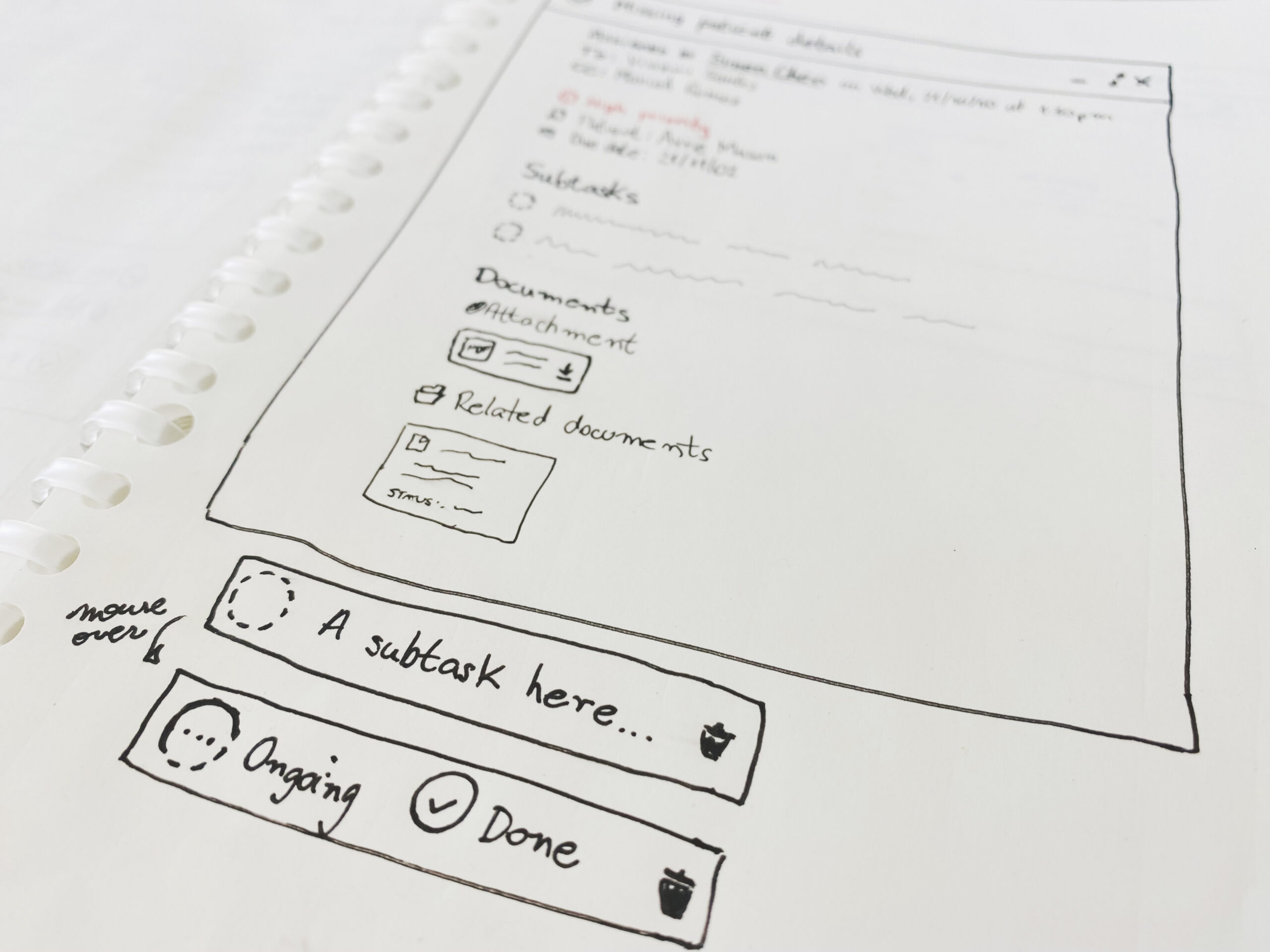
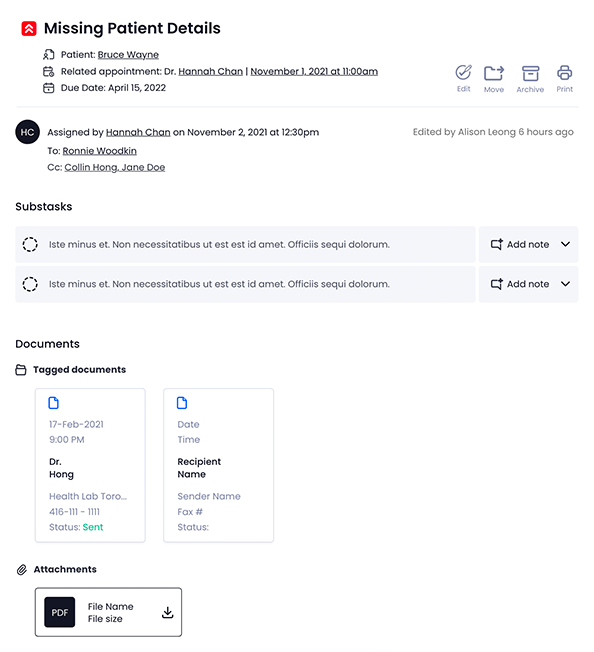
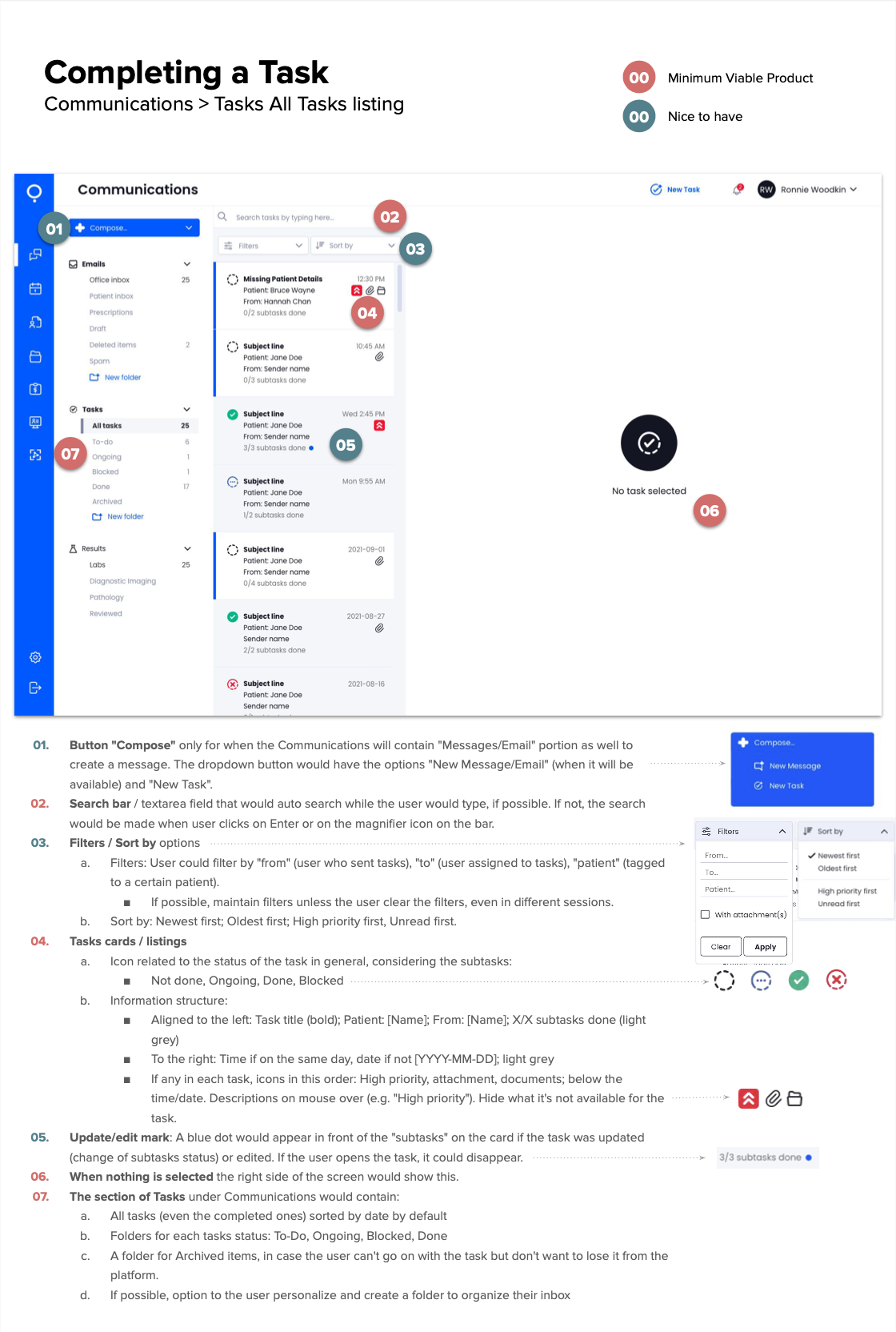
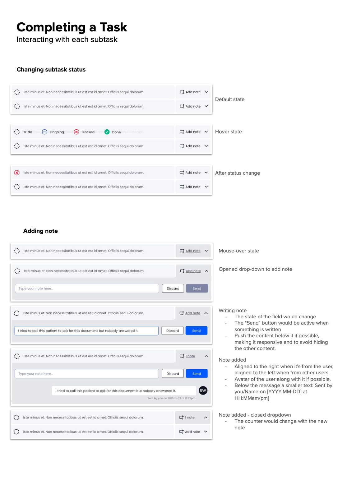
The final version of the subtasks portion of the task opened, from the receiver side. The user could change the status of a task through mouse over (hovering the subtask), and clicking on the chosen status.

The “notes” portion of the subtasks. The user could add a note through a dropdown and collapsible element on a specific subtask – useful, for example, when a task is blocked and the receiver needs to explain something.

In each subtask of a task, four statuses would appear through the hovering state: To-Do, Ongoing, Done, Blocked. 
If the user would want to add a note, a dropdown/collapsible option of notes could be selected and the user could add a note there. E.g., in case the receiver of the task would need to explain why a subtask is blocked. 
 
In the demonstration to the users of the platform, it seemed easy to use and intuitive, but it would require more tests with users when the platform would launch this feature. Since the product is an MVP and has few users currently, we weren’t able to test it further.

Before & After

After analyzing the current/previous state of the EMR UI design, and considering the users’ needs (from the interviews responses), we concluded that some changes would be necessary. Not only to meet the user needs but also the heuristics.
 
The changes can be seen below in the “before and after” screenshots.
So the changes involved:
 
  • Information architecture change in the communications tabs/sections
  • Visual and color codes for the opened, read and unread messages/tasks
  • Change in the way the user would filter and sort the messages/tasks
  • Better hierarchy of information inside each part, including using different font-weight, color, size, etc
  • More contrast in some parts to be better read and identified on the screen
  • Animated or interactive elements like the “Compose” button and the subtasks, that would show the modes for the user to choose (To-Do, Ongoing, Done, Blocked)
  • Use of modified or new icons so the user could identify each element faster and intuitively
In each subtask of a task, four statuses would appear through the hovering state: To-Do, Ongoing, Done, Blocked. If the user would want to add a note, a dropdown/collapsible option of notes could be selected and the user could add a note there. E.g., in case the receiver of the task would need to explain why a subtask is blocked. 
 
In the demonstration to the users of the platform, it seemed easy to use and intuitive, but it would require more tests with users when the platform would launch this feature. Since the product is an MVP and has few users currently, we weren’t able to test it further.

Icons I created for the Skinopathy's EMR

The icons of the platform weren’t personalized for it and sometimes, they could mislead or confuse the user. In order to offer personalized and meaningful visuals, I created many icons for the EMR, not only for the tasks section.

Documentation and handoff to developers

After completing the Communications and Tasks sections, we made documentation called Functional Requirements Document so the developers would know exactly the functions of each element on the screen, and their modes. Also, we handed off the design through the Adobe XD’s Developers sharing (which shows all the coding elements), and through the sharing of the icons organized in folders according to their pages.

Feedback received

The EMR was still in development when my internship ended and would need more tests and improvements like any other platform, but the first versions of the platform that we redesigned or fully designed will be implemented. 
 
However, I already received extremely positive feedback from the current users, administrative staff and doctors, and from the CEO of the company, Project Manager, and lead Developer. 

The CEO, Keith Loo, is open to being contacted and asked about my work at Skinopathy through his LinkedIn profile

Resumé on LinkedIn

Please check out my resumé and past professional experiences on my LinkedIn profile.