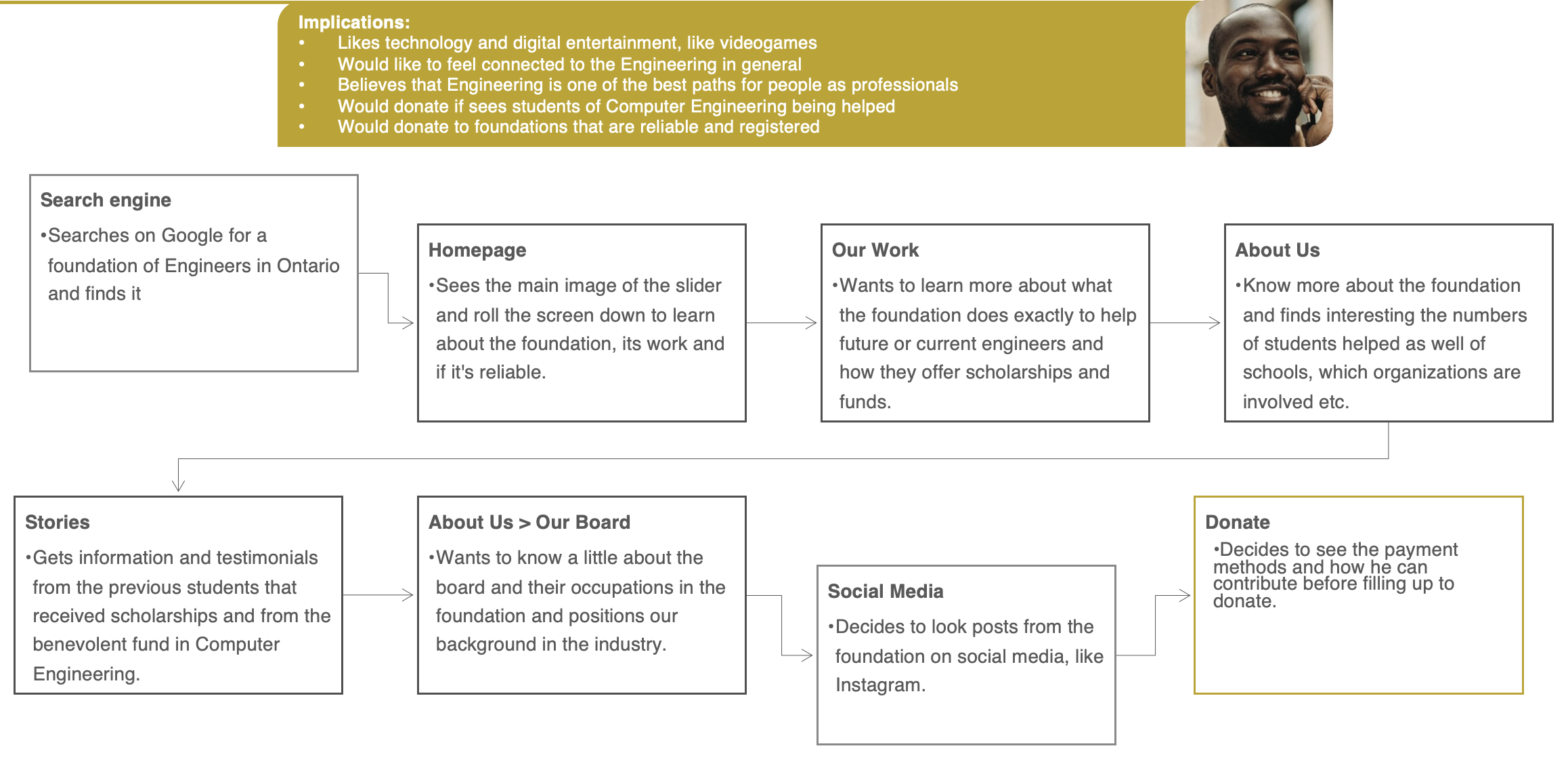
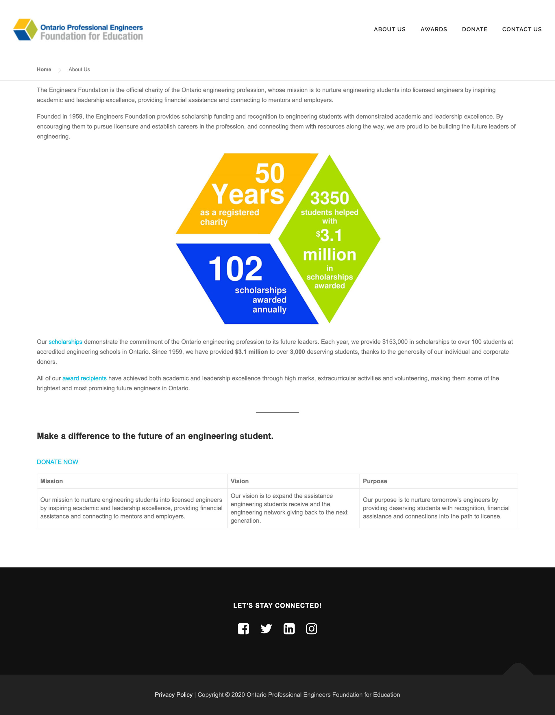
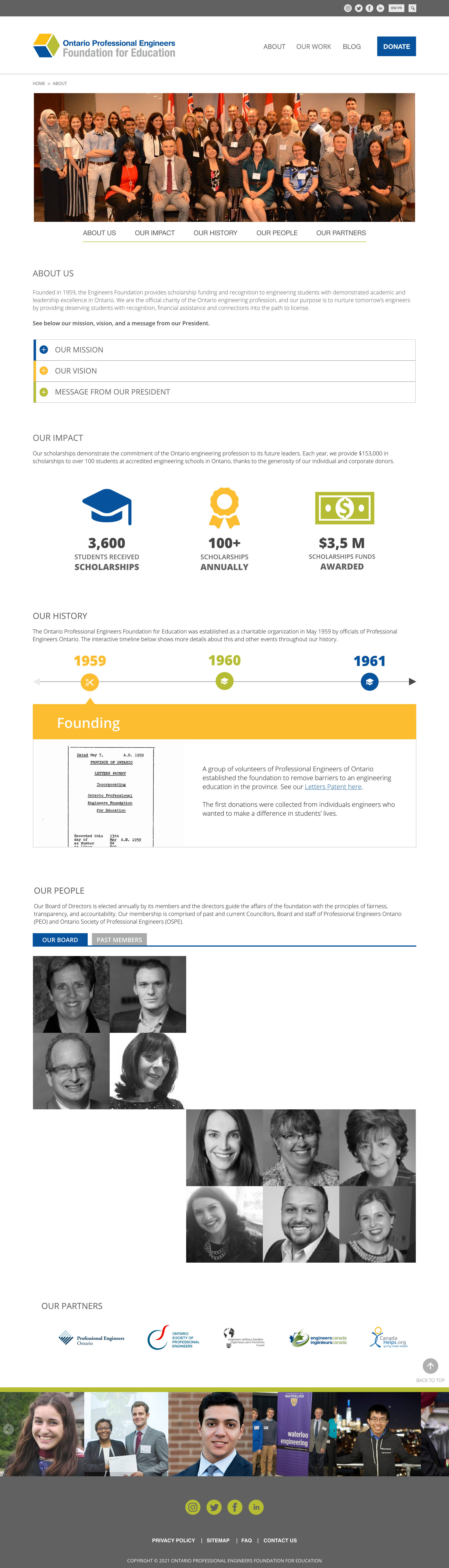
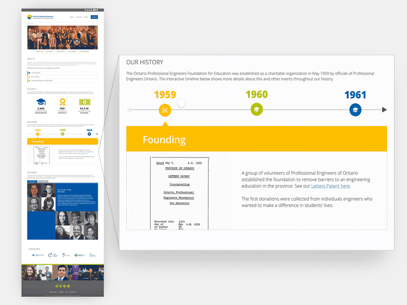
Viviam Alcalde

UX/UI design project for an engineering foundation

During the first term of the college, I was responsible for wireframing and prototyping the “About Us” page for the Ontario Professional Engineers Foundation for Education website, along with team members. I used Adobe XD for this work.

Table of contents

About the project

The Ontario Professional Engineers Foundation for Education is a non-profit charitable organization that funds scholarships for students in the Engineering field. In partnership with Centennial College, the foundation needed a revitalized design for their website in order to represent better what the organization does. 

I was responsible for the UX/UI designing of part of the sections and the whole About Us page, the current state analysis for the whole website, and one of the several personas we have created. I made part in user research, competitive analysis, content strategy, user journey, wireframing, and prototyping.

Main results:

  • My group received a Dean’s Award for Entrepreneurship and Innovation from Centennial College.
  • Our work was well-recognized by the foundation, and it could serve their new website.

The journey of the UX/UI work for the Engineers Foundation​

User Research

Survey & Interviews

Prototype

UI prototype & Documentation for developers

Analysis

Current State & Competitors

Testings

User testing and changes

Personas

Creation & Development

Wireframes

Low, mid and high fidelity wireframes

User Journeys

For each persona

Content Analysis

Content Audit & Content Strategy

The problem with the website and the solution idealized

The problem

A great majority of the foundation’s funding came from one organization, the rest comes from existing members of the organization. With many other charitable causes, it was important that the foundation improved its presence online to obtain more donations. 

The solution

Overall, the website was outdated with very little content or engagement to achieve its objective. Thus, we presented a project of a website that would have a user-friendly interface and a better content structure.

Current State Analysis


This analysis’ purpose was to help with the optimization and redesign of the website’s interface, especially in terms of the user experience, which inevitably improves the image of the organization by making its message and navigation clearer.

Below are two of the pages of the current state analysis made by me for the foundation.

Competitive analysis

We did two competitive analysis of similar institutions or organizations websites to compare them to the client: one for the overall website, another for the content. Both analysis served to help us and the foundation to identify the opportunities

We have selected some criteria for this analysis and compared them, which helped us to create a new digital strategy for the foundation.

User Research

Survey and interviews

We surveyed users and engineers who were unfamiliar with the foundation. We also interviewed some of these participants to get more details about them. Of the many surveys sent out, 15 responses were received to contribute to the final project. 

Main findings

  • Generally, users want to feel more connected to the cause through the recipients’ stories.
  • Users need to trust the foundation before donating.
  • They want flexibility in the donation process so they could help in their way

Personas

Based on the user research, we created several personas and the journeys we should consider. The following is the persona I personally created, as an example, and all the personas my group created for the project.

User journeys

From the user research and the personas, we created a journey for each persona. For Carlos Diaz, as shown earlier, I created the following.

"About Us" page

In the group, I was the responsible for proposing a new interface and content for the About Us page. Through an About page with more content and interactive elements to engage users, they would know all the context and history of the foundation and trust it even more.

Problems identified

  • The information about the foundation was scattered throughout the website.
  • Users would value knowing the foundation more and trust it before deciding to donate (confirmed through User Research).
  • There were pieces of information that wouldn’t mean too much to the user who could potentially donate, which would get in the way of the most important information for the user.
  • The visuals would have to be improved to gain the user’s attention to the main pieces of information.

My design decision and solution

  • Making a “one page” About Us with all the relevant information about the foundation, focusing especially on its history and its people.
  • Creating an interactive and graphical timeline about their history to engage users better instead of the written version, including images to represent each period.
  • Structure the page’s content to “tell the foundation story”, like storytelling through the structure, design, and content.

Before & After

The About Us section of the website had scattered information about the foundation in several different pages
My proposal for the About Us page was include all the relevant information about the foundation in one page

Seeing it today, I’d change some things but this was my first project while studying UX/UI, and the organization was thrilled with the page overall and with this solution for the history portion of it.

Timeline of the About Us page

The organization’s main objective through the website was to receive donations so they could help more students with scholarships. Thus, the history portion of the About Us page was important for both organization’s objective, and for users to trust the organization before donating. 
 
The problem was that the history, by being only an image infographic, wasn’t too interesting to read or user-friendly. Let’s face it: Content about a company or organization’s history is usually boring. So my focus was redesigning the history portion into something interactive and objective.
I decided to include an interactive timeline for the foundation’s history. This timeline would order the history by year, and each year contained the organization’s highlights in that year, along with an image.

Demonstration of the About Us prototype

The new About Us page for the Ontario Engineers Foundation I designed proposed a one-page concept including all the necessary information about the foundation.

Content Strategy

We have created the content strategy by conducting surveys among current users as well as engineers who are unfamiliar with the foundation. We considered both the User Experience (UX) practice and following the Accessibility for Ontarians with Disabilities Act (AODA) guidelines.

  1. Professional but not stuffy

  2. Informative but not wordy

  3. Inspiring but not cheesy

  4. Suggestive but not pushy

  5. Candid but not harsh

  6. Minimal but not vague

  7. Formal but approachable

  8. Clean but not sterile

We made a content structure guideline for each page we worked on.

We also included recommendations according to SEO, one of my specialization from my background in digital content, for a future blog, and other pages of the website that our project didn’t involve.

Information structure

After studying the competitors, the users, and the objetives of the foundation, I suggested a new information structure and site map, as seen below. The About page would include the one-page suggestion I designed.

Documentation and handoff to the client

After completing the project, we delivered to the client all the analysis and a complete strategy for the content and design, including a style guide. Besides that, I made some extra recommendations based on WordPress, since the client asked for that since they used that platform in their website.

We also made a formal presentation to the foundation board and members presenting the suggestions, the wireframes and prototypes.

Feedback received

The project was made during the Interactive Media Management program at Centennial College and because of that, we received excellent feedback from the professors and the client. Our group even received a Dean’s Entrepreneurship and Innovation Award from the college. Our recognition and work for the foundation are also part of an article posted on Centennial’s website.

Awarded

Dean's Entrepreneurship and Innovation Award
Issued by Centennial College · 2021

My group of UX/UI project to a real client received this award that honored our independent thinking, and our initiative in identifying and creating opportunities that established value for the client.

Resumé on LinkedIn

Please check out my resumé and past professional experiences on my LinkedIn profile.