Conceptual product: UX/UI for a platform of video game suggestions
I had the opportunity of creating an idea for a digital product from the concept to the prototype as a UX student at Centennial College, in the Interactive Media Management Program. For this Senior Project, I created Gameya.
About the project
After thinking about a personal problem that I figured many other people would face, I created Gameya project for UX/UI studies purposes, during the second semester of Interactive Media Management program at Centennial College, in 2021.
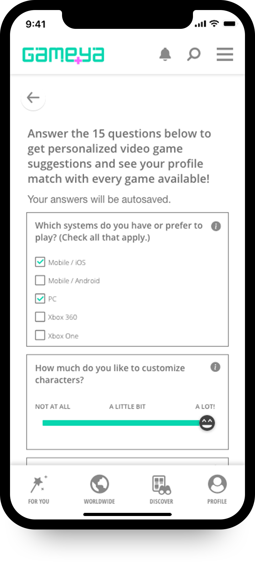
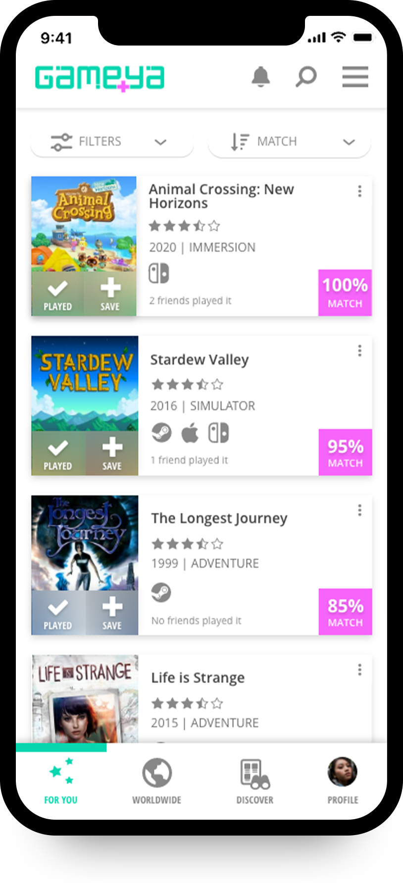
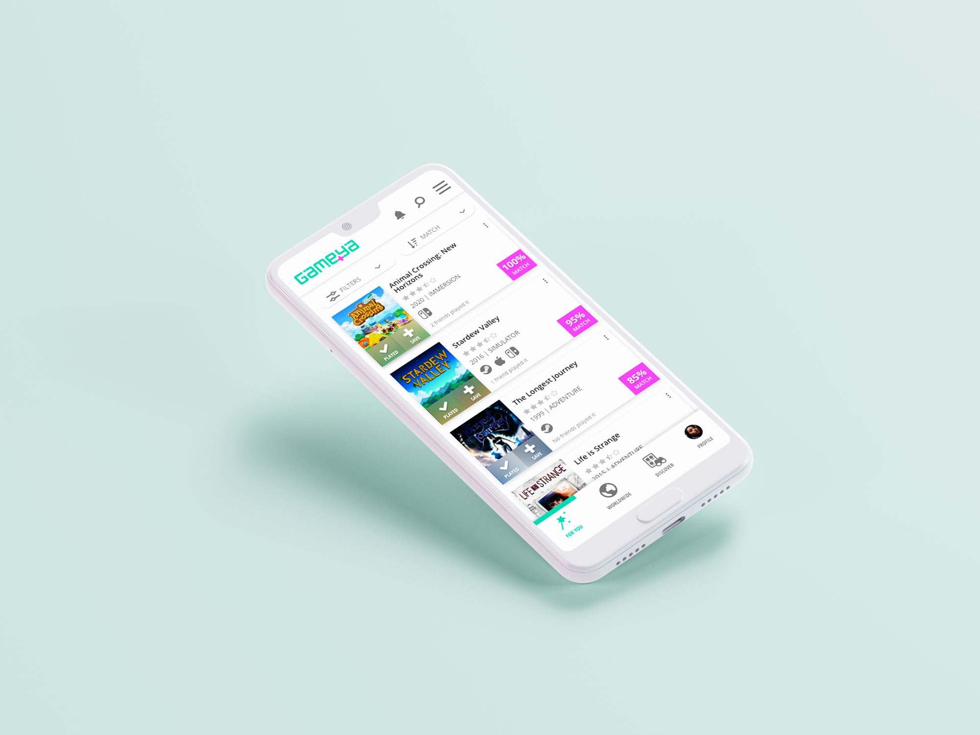
Gameya would be a mobile-first platform that offers personalized video game suggestions to the user based on answers to a survey and also from the interactions on the platform through machine learning. From the ideation to the final prototype, we can see below all the main steps of the project.
The journey of Gameya project
Concept & Hypotesis creation
Final user testing and changes
Survey & Interviews
UI prototype
Quantic Foundry, Steam, etc
User testing and changes
Creation & Development
Low, mid and high fidelity
For each persona
Voice & tone, microcopy, etc
Ideation
I first thought about this project from a personal pain point of not finding video games that I really liked just through the game engine recommendations, and I wanted suggestions that would consider my traits and preferences.
I’ve confirmed through the User Research that this is a pain point for many other gamers and that Gameya would be valuable for them.
Initial hypotesis
“Every kind of gamer, hardcore or casual, most of the time needs to search for games to play on different platforms, read about them on other specialized websites or reviews on a game system, watch YouTube or Twitch videos, talk to friends to get suggestions, etc. This is time-consuming and even by doing that, it is not guaranteed that users will like the game.”
Problem definition
“Many gamers get frustrated instead of enjoying the gaming experience because they lose time and money buying and playing video games that they don’t like or engage in after a time-consuming search.”
User Research
The survey had 20 respondents, I interviewed three of them, and I confirmed the hypothesis. Thus, the following findings based all the UX/UI work from this point forward.
Most mentioned pain points:
- “Hit and miss” aspect when trying a new game that they have heard or read about.
- Frustration and abandoned games.
- Suggestions on game platforms don’t meet expectations.
- Hardcore gamers have difficulty in finding older games to play on platforms.
Several people interviewed also said they:
- Ask family members and friends for game recommendations.
(So Gameya would try to fit that friend role.) - Face difficulty in getting a good perspective about games from descriptions, articles, or videos.
(Thus, Gameya would include reviews from users and gameplays from influencers, besides the official descriptions and Gamey’s blog articles.) - Want to have the experience in a clean and easy to use interface.
(That’s why Gameya follow the minimalistic style and a simple and light communication.)
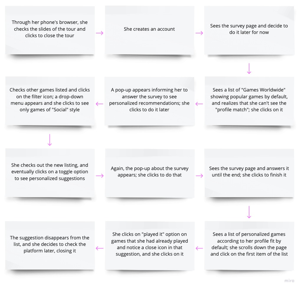
Anna's journey
UI Design
Paper wireframing
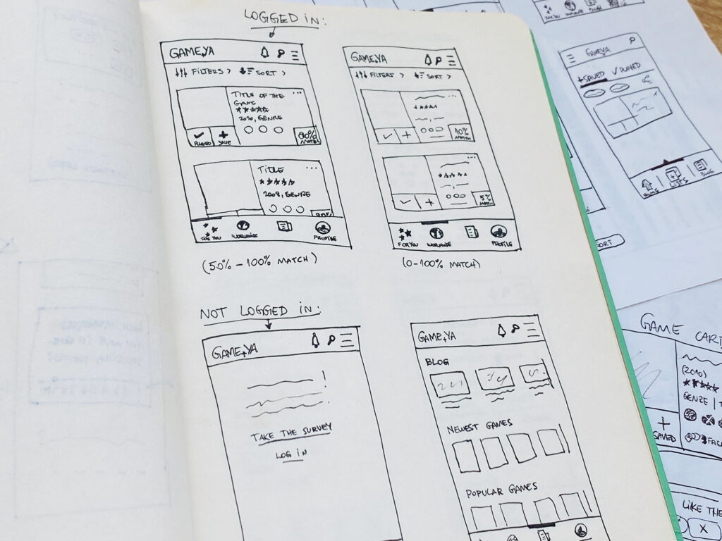
The sketches of Gameya reflected a mobile-first platform, which users said they would prefer to use. I studied the competitors and the tendencies of design to make some design decisions.
While paper wireframing, I tested several approaches, as seen below. The one that made more sense was having four options on the bottom menu, and the general options and hamburger menu on the top bar.
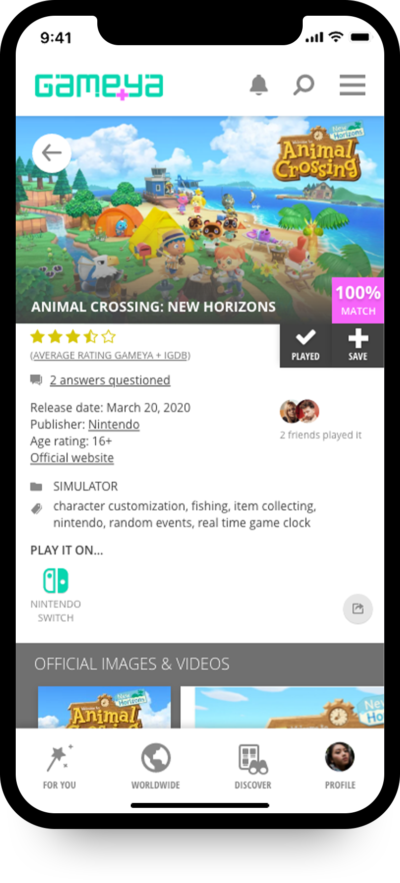
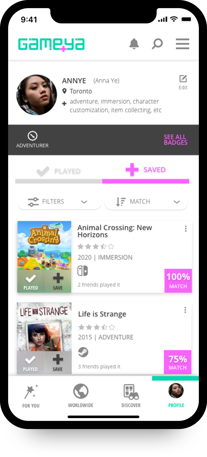
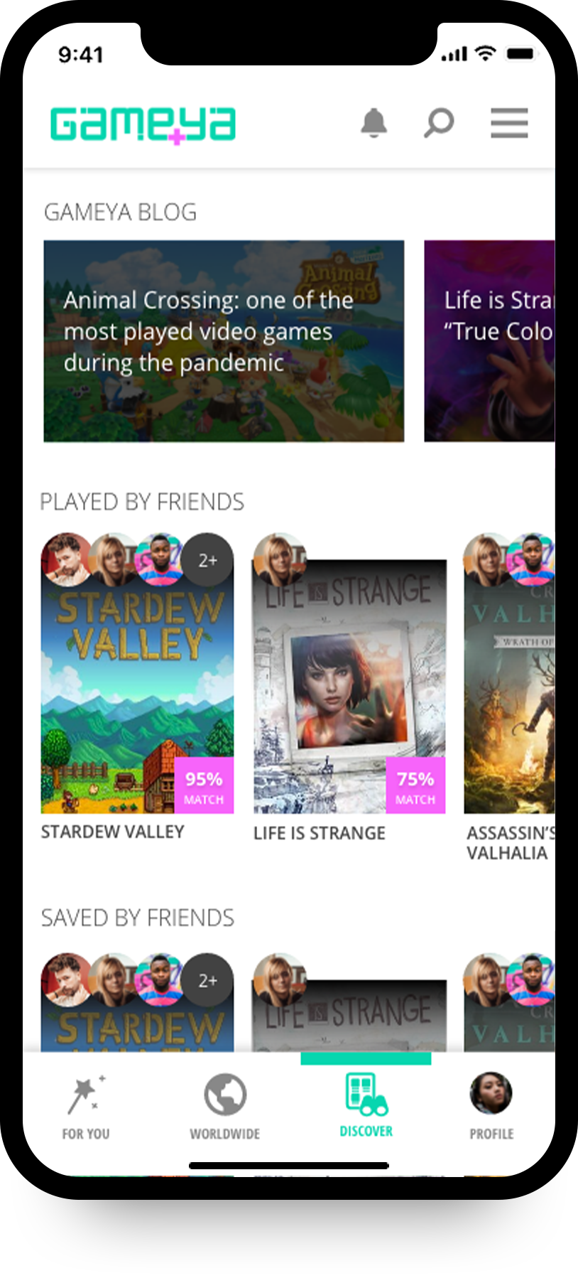
High fidelity wireframes
Icons I created for Gameya
In order to offer personalized and meaningful visuals, I created some icons for Gameya.
A user journey in action
Content Strategy and Microcopy
Considering the user research findings, and that the target of Gameya would be gamers and people wanting to have some fun, the voice and tone of the platform would be informal, friendly, and enthusiastic.
From the user research, I found that most people would like to have easy and simple information about games, and they would use the platform during work breaks or during their spare time when they want to relax. Most people also revealed that they ask friends and family about video games recommendations.
Because of those reasons, besides the voice and tone explained before, my intention in Gameya would be having clear and objective communication so people would easily understand the information in a light tone.
Examples of the content strategy and microcopy of Gameya
Try the platform through the live prototype!
Please access the link below, via Adobe XD live link, to navigate Gameya’s prototype.
